
update :
Q-Q plots can be used to test goodness of fit for any distribution. There are p-p plots and other method as well.
There is also a P-P plot.
https://en.wikipedia.org/wiki/P%E2%80%93P_plot
Since few days I was coming across to Q-Q plots very often and thought to learn more about it.
Full form is Quartile-Quantile plot.
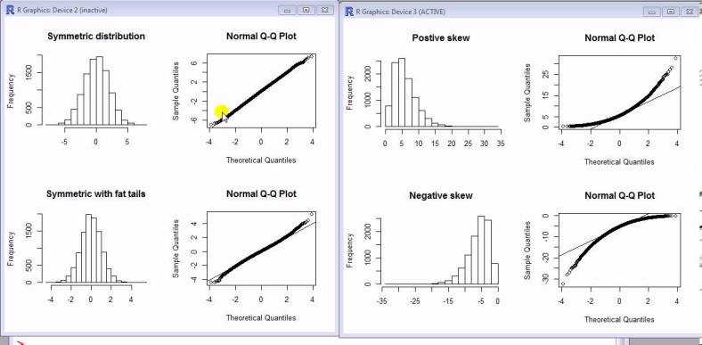
Many a times we want our data to be normal, this is because we normality is an assumption behind many statistical models. Now how to test normality. Wikipedia has an article about this which lists many method, one of them is Q-Q plots.
Here is how to create Q-Q plot manually (This steps will show the theory behind it):
- Sort your samples (Call it Y). Let n be no of sample. n = len(Y)
- Find n values(quartiles) from standard normal distribution to divide it in (n+1) equal areas
- Standard normal distribution is a distribution with mean = 0 and standard deviation = 1
- Call above X
- Plot Y against X
- For normal distribution it would be approximately straight line
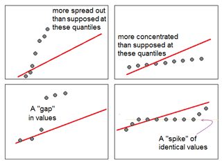
- However considering probability, outliers and no of smaples have role to play
Here is the example code and plots in pythons:


Reference :

